A visit to the National Portrait Gallery - “more presence, more reach and more relevance”.
After a three-year closure, the gallery unveiled its newly configured space and brand identity. Phoenix Wharf went to London to explore the changes.
Edit, a brand studio based in Manchester, were behind the intelligent re-design of the identity. For the logo, they pulled references from sketches created by the gallery’s first director in 1893. Working with typographer and illustrator Peter Horridge and type foundry Monotype, a new monogram, logotype, typeface and colour palette, all inspired by historic reference points, were created.
Contemporary Artist Tracy Emin was also commissioned to design 45 portraits representing women of all ages and ethnicities. Their intention is to contrast with the display of men depicted on roundels above the first-floor windows.
The team behind the gallery’s re-brand conducted audience research, and as a result discovered that the identity must display “an exciting balance of classic and contemporary”. The Gallery’s Director of Communications & Digital Denise Vogelsang explained “we wanted a brand that could sit seamlessly alongside our magnificent grade I listed building, our historic and contemporary collections as well as appeal to a diverse range of audiences, existing and new”.
Throughout the new gallery, cleverly placed logos can be found on wayfinding, maps, artwork plaques and even in the mosaic on the floor. And as for the space, remodelled by Jamie Fobert Architects together with heritage consultants Purcell and exhibition designers Nissen Richards Studio, a brand new, step-free entrance has been created around the north side of the building, and the galleries that were there before have been converted into a reception area and a shop. It works out as roughly three times the size of the old entrance and the result is a broad, airy space which gives views from the street directly into the heart of the building. The designers of the space expressed “everything we’ve done around circulation is about giving people choice”
Furthermore, the new space now utilises the Portland stone arches of the building, creating access points from both the main hall and the Victorian staircase originating from the original entrance. Again, offering people choices. These Portland arches also mirror the shelving units on the walls, almost reaching the height of the ceiling. Inside these shelves, halos of light illuminate the portraits on display while also capturing the attention of pedestrians passing by on the street outside, enhancing the inviting and inclusive feel the new gallery now has.
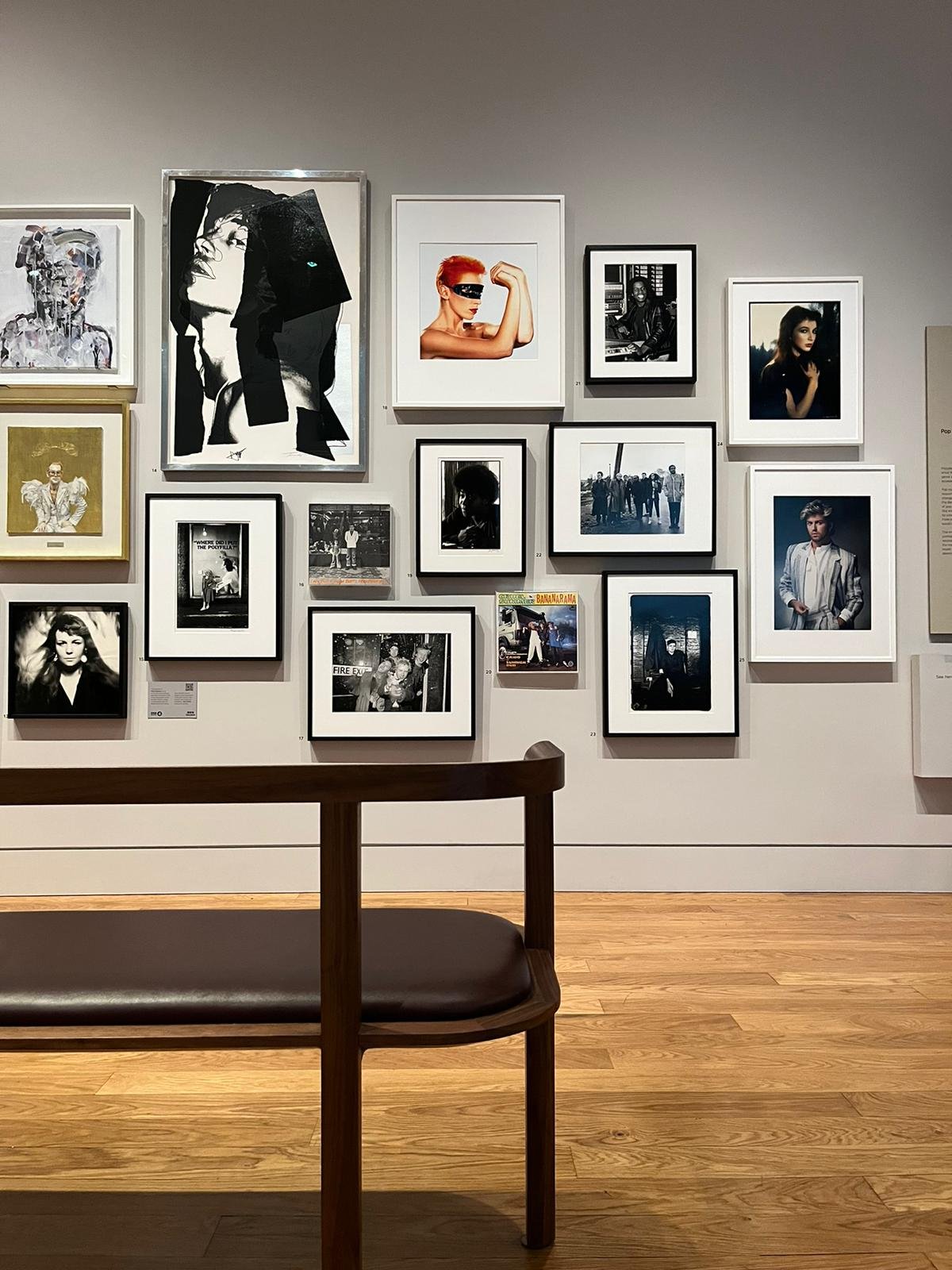
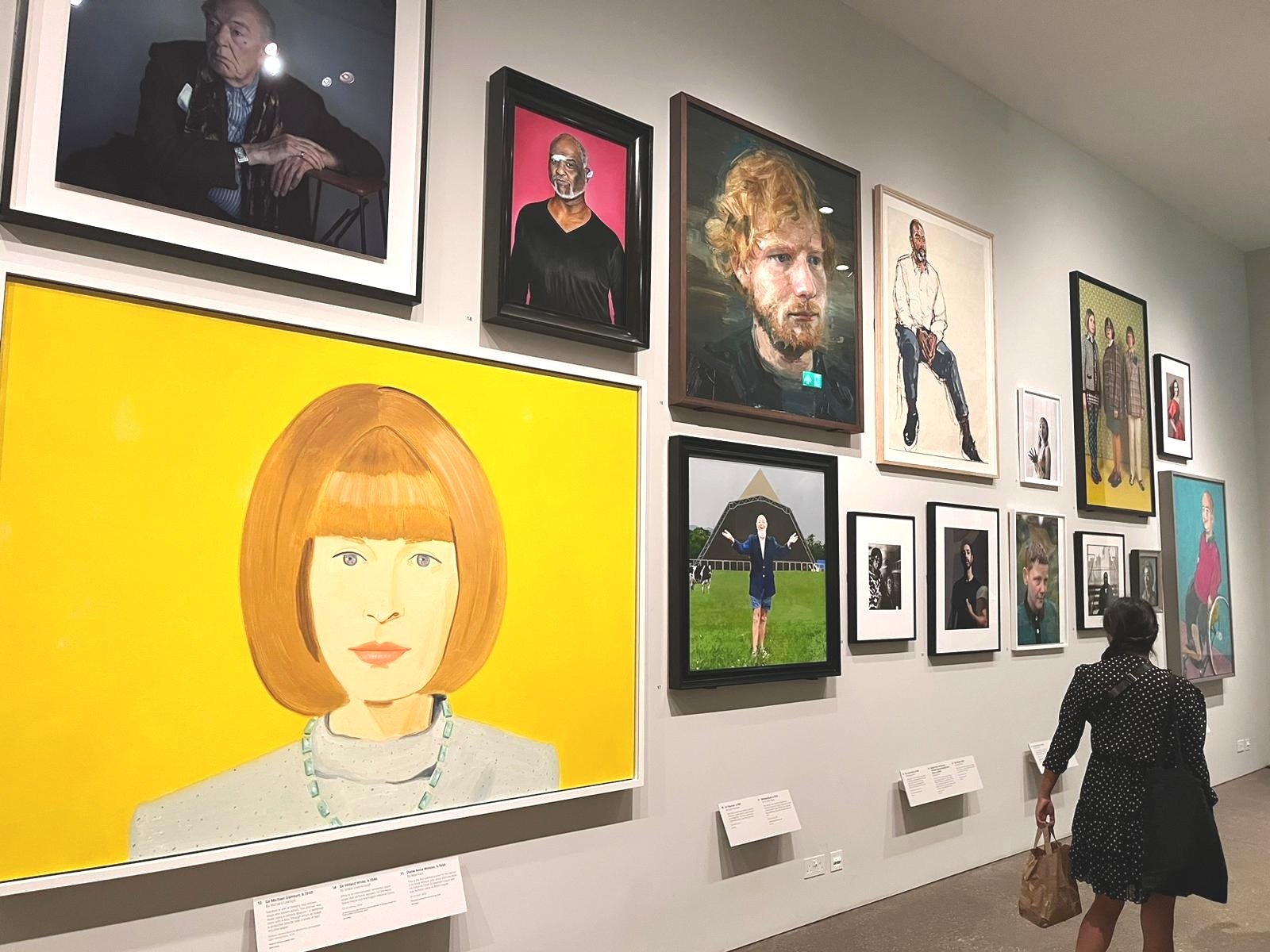
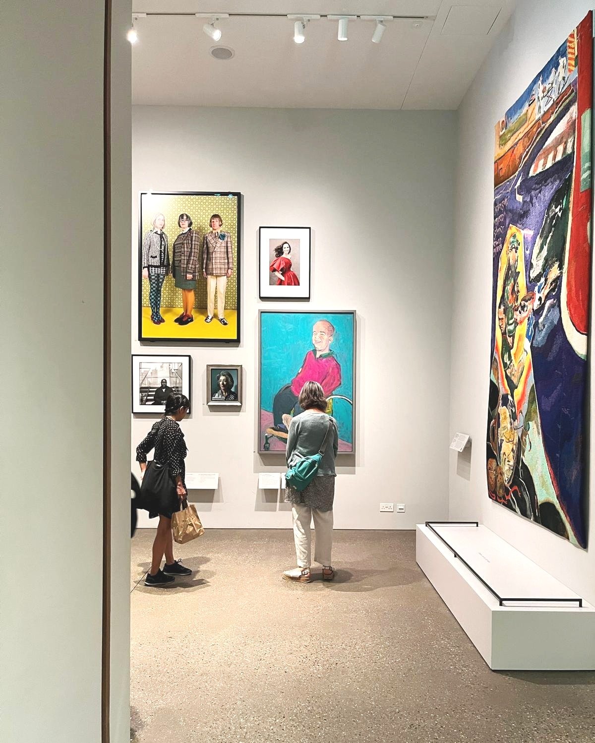
As for the rehang, the galleries cover a range of themes from Tudor to contemporary. However, unlike the previous layout, there is now a juxtaposition of artworks hung next to each other. For example, Queen Elizabeth II is now placed next to a self-portrait of Chantal Joffe, a placement that would’ve before caused commentary. In another room, Mark Quinn’s bust filled with blood can be found atop a fridge, preventing decay.
One thing to note, the gallery which was historically dominated by portraits of white men, now displays a diverse array of subjects. This mirrors the societal changes that have occurred since the gallery's last major rehang several decades ago, acknowledging a broader spectrum of individuals deemed important. One might wonder whether the previous collection would have included a young Marcus Rashford if he had lived during an earlier era. But in the new gallery, there he stands, side by side with King Charles III.
Our trip to the NPG was inspiring, insightful and thought-provoking. It is refreshing to see how a once exclusive and stuffy gallery can be transformed into a bright, welcoming and inclusive space through architectural, spatial and brand redevelopment. The message to us is clear: the gallery, which has forever been – and still is – dominated by portraits of rich white men, has become a gallery for everyone.
Thank you for reading!


