Insider - The Importance of Spatial Design
In the UK, it’s estimated that we spend an average of 90% of our time indoors (approximately 22 hours per day) which may seem staggeringly high and yet for the majority, also seems accurate. A combination of working from home and lifestyle changes like online shopping mean we no longer walk everywhere or spend our weekends traipsing around the shops.
While we should probably all try and get outside more, the amount of time we spend inside points to the fact that our interiors play a huge role in our wellbeing. Interior design is so much more that making a space look good. Colours, textures and lighting are all essential ingredients but before any of that can be considered it is crucial to consider how your space works.
The effects of spatial design on your mood and behaviour are often talked about in the context of residential design. Is your sofa too close to your TV? Have you maximised the sunlight in your north facing home? Etc. But what about in public hospitality spaces? If our interiors have been proven to impact our feelings, behaviour, and physical wellbeing then it seems obvious that the function, layout, and adaptability of your restaurant can have a tremendous impact on the success of a business.
Budgets, as well as the previous inhabitants, of a space often impact what a brand chooses to do when getting the keys to a new site. Despite different offerings and potentially entirely different target customers we regularly see the addition of a new counter and a lick of paint reframed as a ‘new interior’. But does this work? If you are lucky, yes. But mostly no.
To illustrate the importance of spatial design when planning your interior we have shown an example below. The plans show a ‘before’ and ‘after’ using the same footprint and requirements but transforming the layout to maximise spatial flow, convenience and customer satisfaction.
The spatial layout is for a fast casual day time restaurant offering take away and dine in food. Lunchtimes were previously the busiest with office workers making up a large portion of visitors, but a steady stream of customers was present throughout the day consisting of stay-at-home parents meeting for a coffee, people working on laptops and those just meeting up for lunch, a drink, and a cake.
Before

Plan - Before
The customer enters the space through central double doors and walks left via the chiller (1) to the counter (2). The menu is above the counter on the back wall so if they missed anything in the chiller it’s too late to go back for it, or inconvenient to push through queueing customers.
A retail display with several products is behind the counter and located after you have already paid (3), this was reflected in poor sales of these items.
The main route out after collecting food is blocked by a building column (4) and the layout of the seating meaning customers must go against the queue to get to the middle of the space to exit (5). This middle lane is narrow and with benches pushed out this space is busy and awkward making it uncomfortable to pass through.
Finally, the condiments (6), stirrers and napkins are located at the exit – not too bad if you are grabbing a coffee to go but if you are eating in and not seated by the door this is not ideal.
These are just some of the ways in which the spatial layout and lack of considered customer flow within the space can make several simple tasks awkward, uncomfortable, and inconvenient. If you are popping in for lunch to go, this would not be an experience you would rush to repeat or tell your friends about.

The isometric view of this below highlights some of these challenges in 3D. The most desirable seats are the hardest to get to and are blocked by those waiting to collect food and drinks - shown in yellow. The central walkway is highlighted in pink, narrow and impassable during busy periods. The area highlighted in blue shows additional seating that is mostly obscured by the queueing customers that was never used.
After

Plan - After
Customers enter the space and walk to the right into an open space with a chiller, shelving for products and additional ambient food (1). This is off the main walkway. Baked goods and merchandise are no longer recessed at low level into the countertop but on display above (2) making them visible from the entrance.
The counter itself is long to allow for the busy periods (3) and leads to a dedicated collection point with a space to put down drinks and collect condiments, stirrers, and napkins (4).
After this point the customer can either enter the seating area or exit via the main walkway alongside the queue which is large enough for two-way traffic. The seating area (5) consists of bar stools, benches, chairs, and booths catering to a variety of different customers throughout the day. Faster turnaround seating is closer to the counter and exit for convenience while those wanting to sit for longer can position themselves in a booth (6).
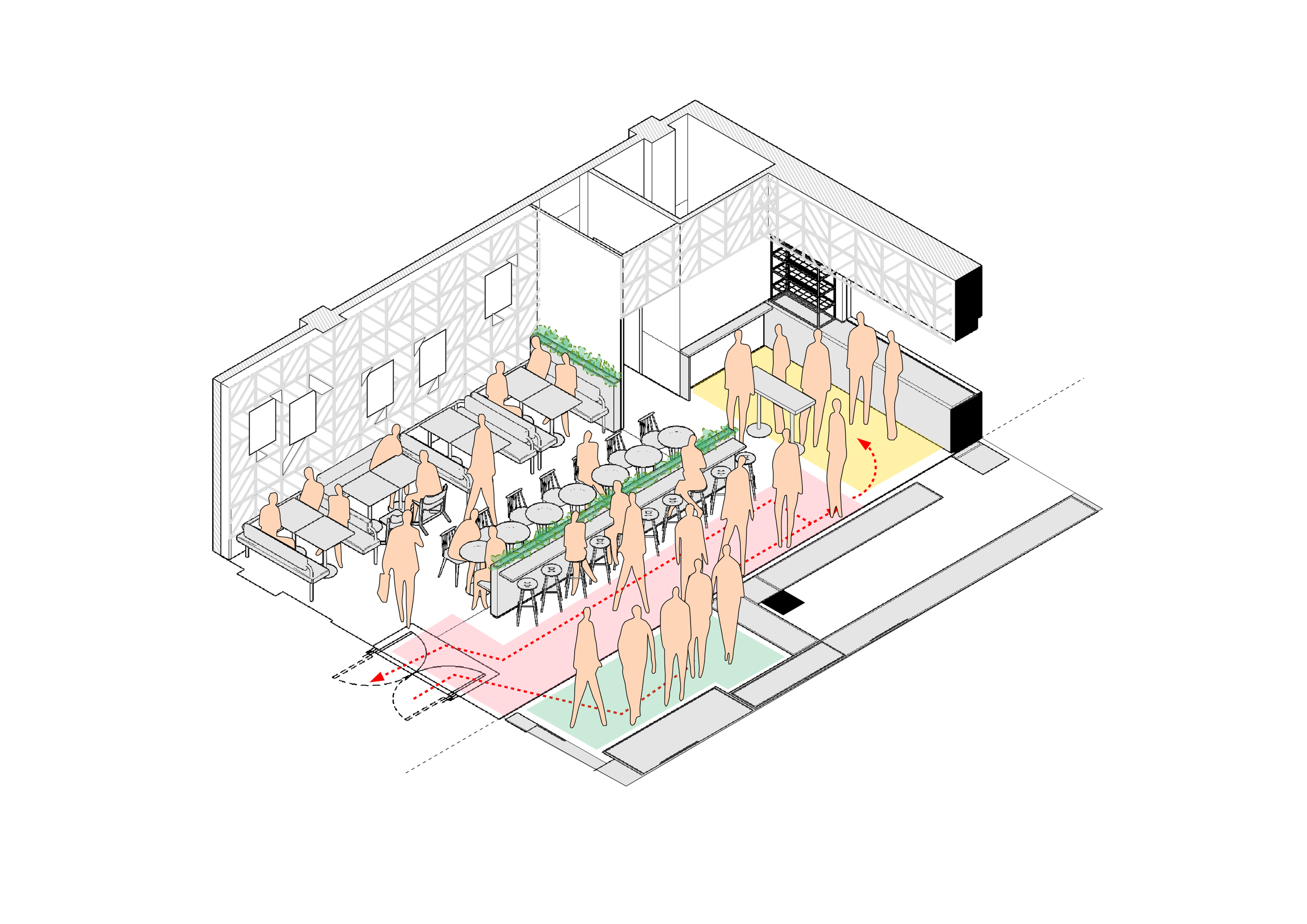
The Isometric view of the design shows the variety of seating styles as well as the key areas. The walkway (shown in pink) is wider for continuous flow of traffic, the chiller and ambient displays are off the main walkway (shown in green) and the collection point (shown in yellow) does not block traffic flow into the seating area or back to the exit.