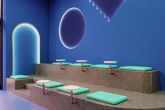
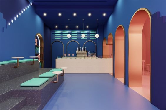
Trend - Colour Drenching
What is colour drenching? The trend is all about immersing your space in one colour, from the walls and ceilings to the furniture and fittings. Different materials and textures provide visual interest and variety in this bold approach. Other options include using tonal variations of the same colour to create subtle contrast within the environment.
We have selected some of our favourite bars and restaurants that have embraced the colour drenching trend and committed to bold, immersive and memorable interiors.

Image via Designboom
Ice cream parlour Brando in Madrid drenched the interior in blue with only a glowing yellow lightbox for contrast. The effect is dramatic and immersive and feels like I imagine swimming in Joan Miro’s ‘Blue’ would feel.
Cloud and Co. Image via WeHeart
Same Colour - Different Materials
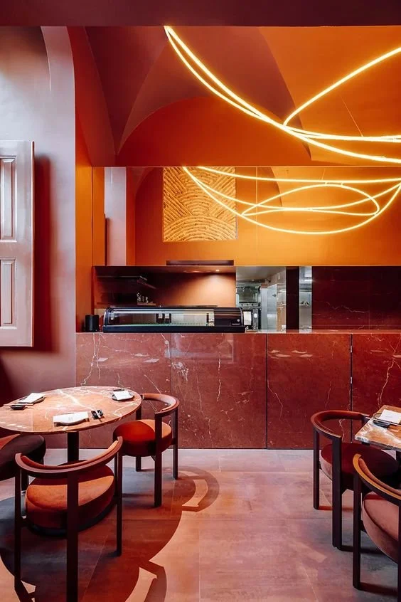
Clever use of different materials in the Nomada Chiado restaurant in Lisbon are a great example of colour drenching without making the space look flat.
The contrast between glossy marble, rich red velvet and smooth matt painted plaster combine to create one colour palette with plenty of visual interest.
Mirror and lighting add movement and a sense of dynamism, although the beautiful arched ceiling also helps with this.
The resulting interior envelopes guests in its warmth.
Nomada Chiando image via Spacegram
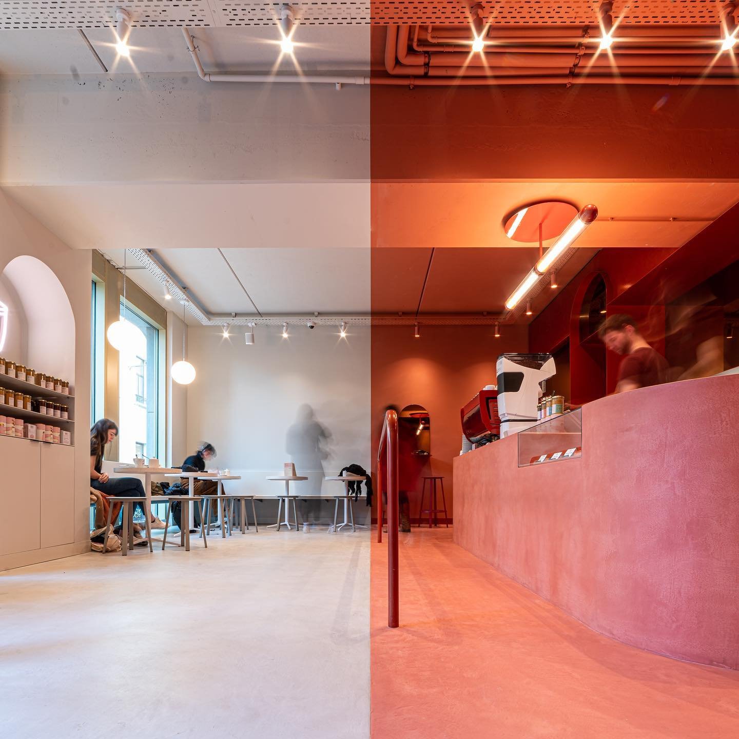
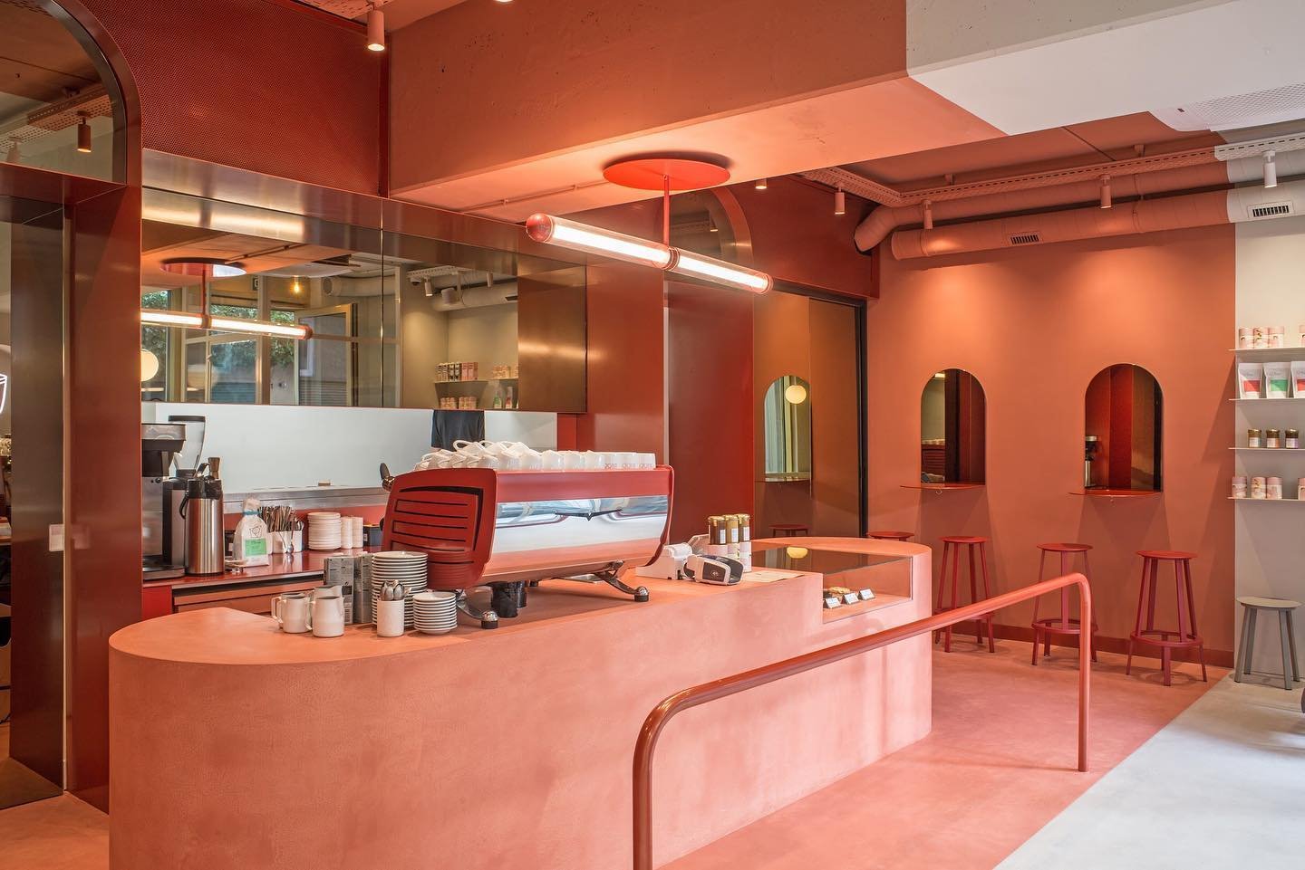
Image via Instagram @buddybuddy
Nut butter bar Buddy Buddy in Brussels have colour drenched two areas with a very strict delineation across the space. This is really impactful in terms of zoning but also creates interesting vistas depending on where you are standing or sitting. There is no crossover of colours between the two areas, everything is either a muted red or a soft grey/white.
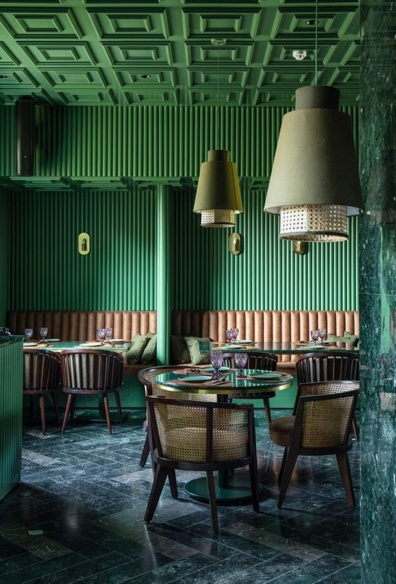
Elgin Cafe, India. Image via thespaces.com
Texture and pattern abound in the Elgin café via fluted walls, herringbone granite floor and wicker seating and lighting details. Green is associated with health and wellbeing and is often used as a way to create calming spaces. This scheme uses the colour in an energetic way creating an unusual dichotomy.

Above is one of our latest projects that adopts the colour drenching trend and has also been shortlisted for a Creative Retail Award. Check out our case study for Oh So Yum!