News

Understanding colour theory and complementary colours: How can we pick colours wisely when designing brands and interiors?
Think about the colour red. What comes to mind? Perhaps feelings of anger or love, or perhaps items like lipstick or a stop sign.
Although these might not have been your precise feelings triggered by the colour red, it is likely you associated ‘red’ with some specific emotions. This is a universal human experience and it’s a powerful tool you can use and manipulate to enhance your work as a designer. Recognising that a selection of colours extends beyond individual preference, can help you enhance not only the usability of a brand or interior, but also in influencing consumers who interact with it.
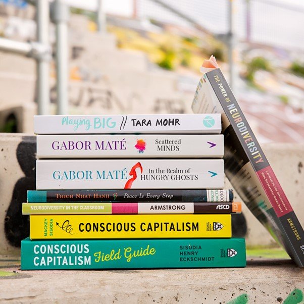
Designing for Neurodiversity
Interior design has, for most of time, been based around making spaces functional, safe, and beautiful by means of colour, texture, furnishings, lighting, art, and so forth but the goal posts in today’s society are changing. It is time to broaden our perspective on how a space can provide support and nourishment to the neurologically diverse.
Material Matters; Our top 5 picks
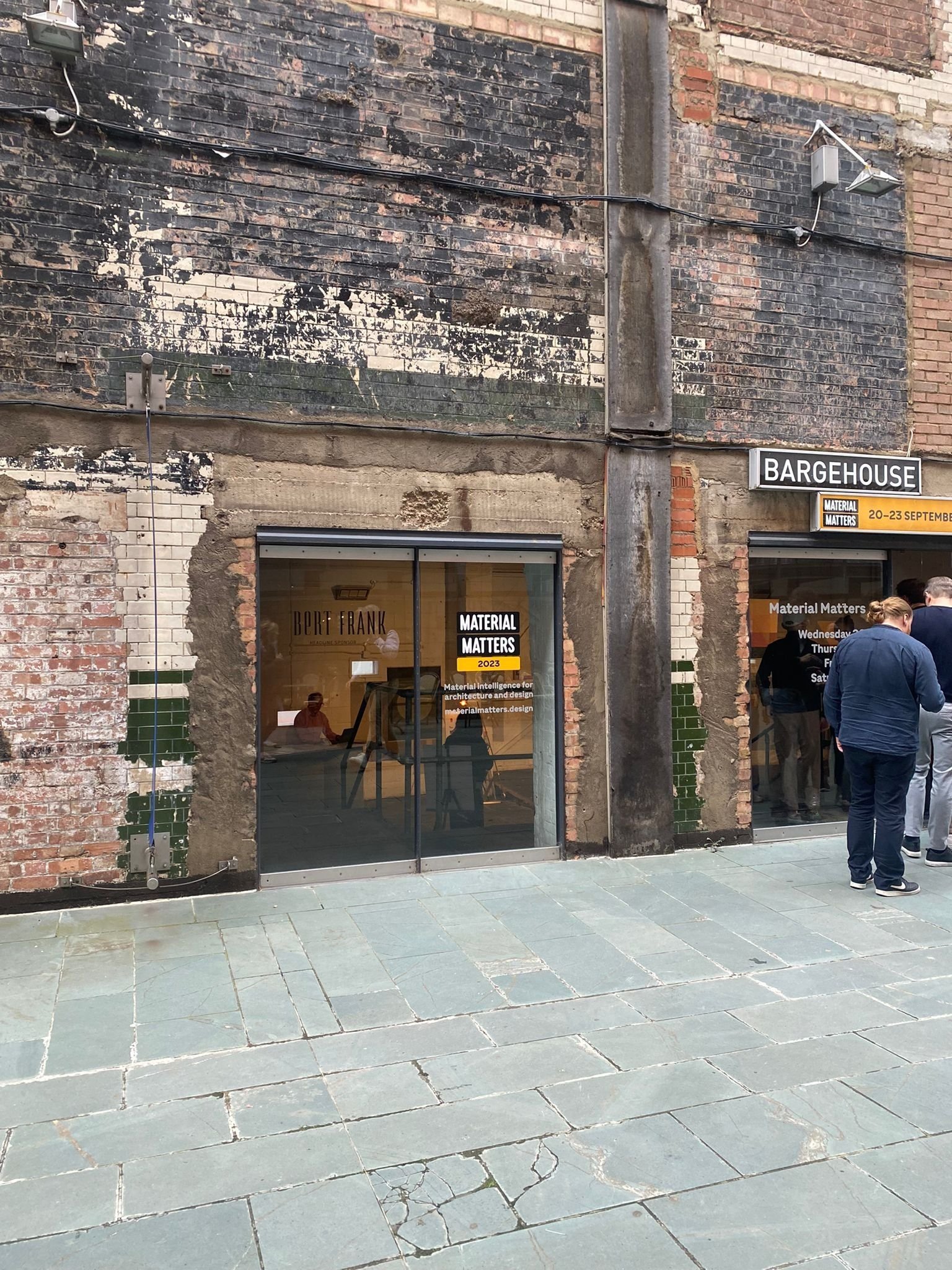
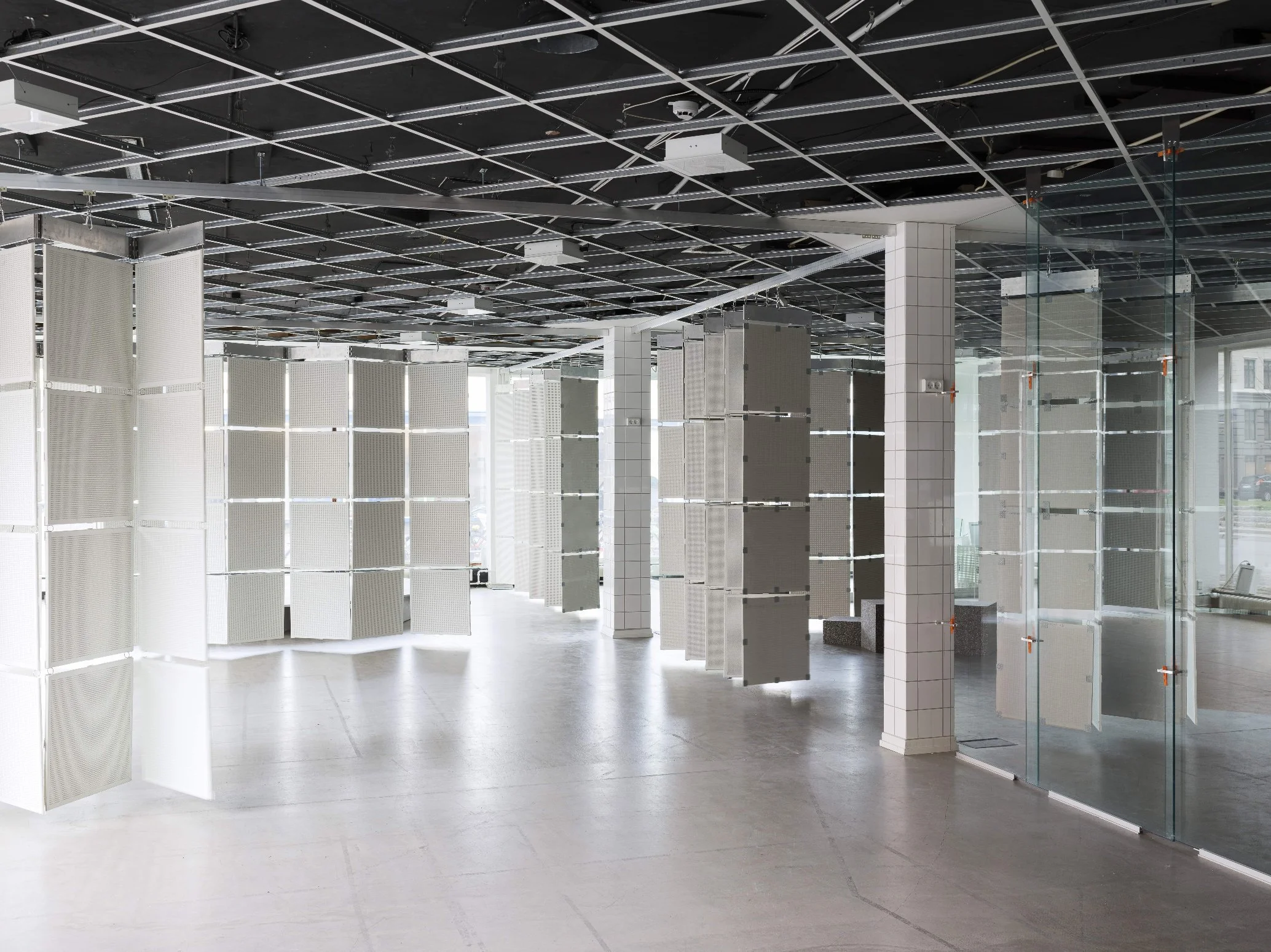
This week the studio visited Material Matters at Bargehouse, Oxo Tower Wharf as part of London Design Festival. The fair has brought together world leading brands, designers, makers and innovators to investigate and celebrate the importance of materials and their ability to shape our lives.
Touch, Texture and Tactility: Clayworks
Are we losing touch with touch? Through the pandemic especially, we were desperately short on the textures, warmth, and imperfections that come from engaging with things in the tangible world — handcrafts, textiles, building materials, and each other.

A visit to the National Portrait Gallery - “more presence, more reach and more relevance”.
After a three-year closure, the gallery unveiled it’s newly configured space and brand identity. Phoenix Wharf went to London to explore the changes. Edit, a brand studio based in Manchester were behind the intelligent re-design. For the logo, they pulled references from sketches created by the gallery’s first director in 1893. Working with typographer and illustrator Peter Horridge and type foundry Monotype, a new monogram, logotype, typeface and colour palette, all inspired by historic reference points, were created.
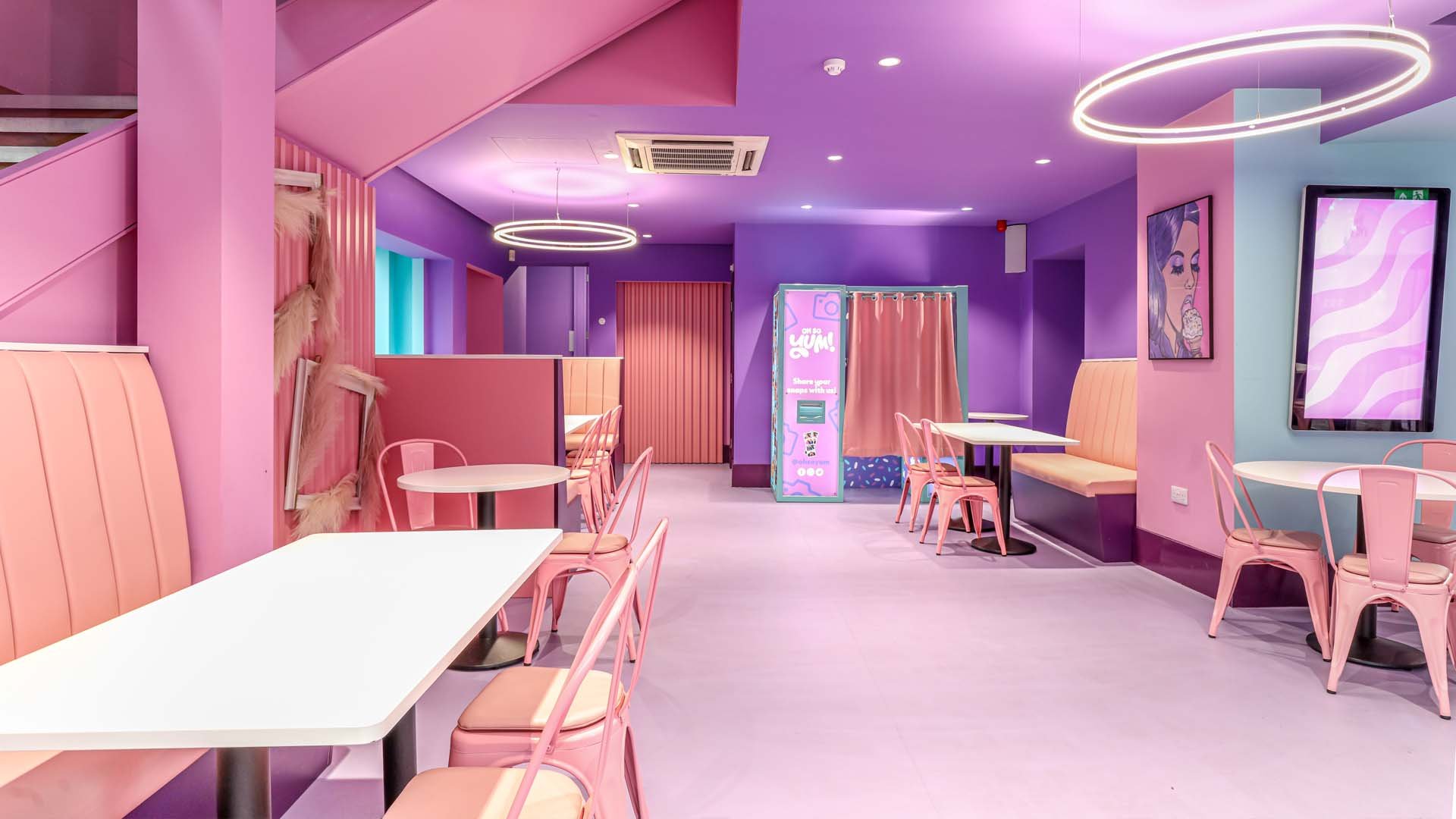
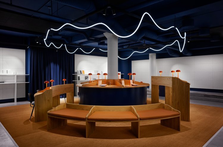
Trend - Colour Drenching
What is colour drenching? The trend is all about immersing your space in one colour, from the walls and ceilings to the furniture and fittings. Different materials and textures provide visual interest and variety in this bold approach.

Sustainability In Design - Foresso
Here at Phoenix Wharf we are proud to have the coveted BCorp status. Part of this, for us, means continually striving to be more sustainable in design. When starting out on a new project, we always look to include something that’s not only sustainable but innovative too.
Reused & repurposed pop-up: Art Hub Copenhagen
We like that Art Hub Copenhagen, a former meatpacking building-turned-bank, has been transformed into a temporary arts centre.
We take a look at the branding behind The 2022 Beijing Olympics
We take a look at the branding behind The 2022 Beijing Olympics

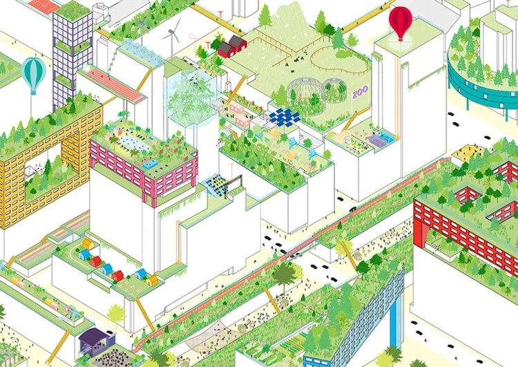
2022 Trends Part 3 of 3
2021 shone on a spotlight on both social disparity and the climate crisis. What trends will 2022 hold in store?
2022 Trends: Part 2 0f 3
2021 Shone a light on both social disparity and the climate crisis. What trends will 2022 hold in store?
2022 Trends: Part 1 of 3
2021 shone a spotlight on both social disparity and the climate crisis. What trends will 2022 hold in store?
Work from home statistics
There’s no doubt the pandemic caused a huge leap forward in flexible working. Here are a few stats on the state of WFH.
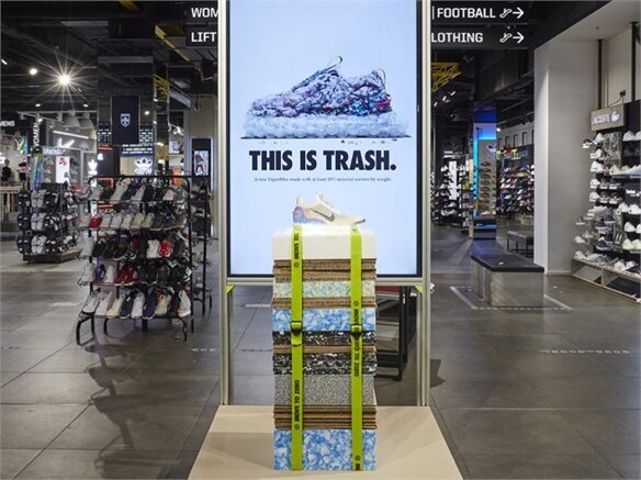
Sustainable Hospitality & Store Design
We look at new eco-led design tactics, treatments and innovations, and the pioneers driving them.

Start Ups on the British High Street
Major shopping destinations are supporting start-ups to help reinvigorate the British High Street.

FX Magazine feature The Bristol Loaf
FX Magazine featured The Bristol Loaf as the lead project in a special section on bars and restaurants, followed by an interview with Chris Gwyther.


Forward-thinking department stores
Forward-thinking department stores are looking to broadcast tactics to drive sales and engage pandemic-era consumers.