Understanding colour theory and complementary colours: How can we pick colours wisely when designing brands and interiors?
Think about the colour red. What comes to mind? Perhaps feelings of anger or love, or perhaps items like lipstick or a stop sign.
Although these might not have been your precise feelings triggered by the colour red, it is likely you associated ‘red’ with some specific emotions. This is a universal human experience and it’s a powerful tool you can use and manipulate to enhance your work as a designer. Recognising that a selection of colours extends beyond individual preference, can help you enhance not only the usability of a brand or interior, but also in influencing consumers who interact with it.
To harness the power of colour, we must begin by understanding the colour theory and colour wheel. This will help us to master the use of complementary colours and create impactful colour schemes triggering psychological effects. Whether you're learning about this subject for the first time or seeking a refresher, here's a guide on where to begin…
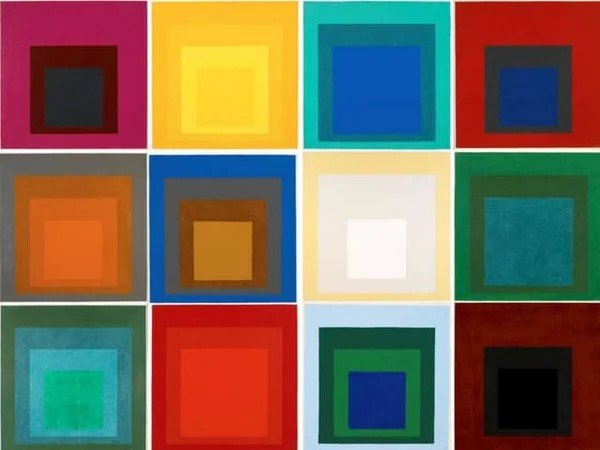
Josef Albers - Homage to the square
Understanding Colour Theory
Colour theory can help designers determine which colours pair well. You might think colour theory is just seeing what ‘just looks good together’ but really, it goes beyond this.
At the heart of colour theory is the colour wheel, created in the late 17th century by Sir Isaac Newton.
Today, the colour wheel serves as a tool for artists and designers to discover harmonious colour combinations based on the relationships between colours on the colour wheel.
For example, a triadic colour scheme involves three evenly-spaced colours on the colour wheel - resulting in a bold colour combination. A tetradic colour scheme involves four colours evenly spaced out on the colour wheel - creating a combination that consists of one dominant colour and two accent colours.

Sir Issac Newtons - Colour Wheel

Johann Wolfgang von Goethe - Theory of Colours
The Colour Wheel
The colour wheel is a device that displays colours around a circle, ordered according to wavelength. Colour wheels allow colour relationships to be represented analogously, and show the relationship between primary, secondary and tertiary colours.
In the traditional colour wheel (RYB), the primary colours are red, yellow and blue. By mixing primary colours, you can create secondary colours—orange, green, and purple. Red and yellow create orange. Yellow and blue creates green. Red and blue creates purple. Mixing secondary colours and primary colours together creates tertiary colours.
Complementary colours
When pairing colours, balance and harmony can be found through pairing complementary colours - in this instance, opposites attract. So, drawing two colours on the opposite side of the colour wheel results in a high-contrast, bright and disruptive colour combination - perfect for a disruptive hipster restaurant brand. Examples of these are: Red and green; yellow and purple; orange and blue; green and magenta. Think Van Gogh and his sunflowers. Van Gogh created a series of sunflower paintings, all with different complementary colours as the background. To throw in a third colour, and make the colour scheme less intense, you can use a split complementary colour scheme. It uses one colour as a base and two colours adjacent to its complement.

Vincent Van Gogh - Sunflowers

Vincent Van Gogh - The Starry Night
Using colour theory to your advantage as a designer
Now, let's explore how designers can adopt colour theory to elevate their projects. Remember the last time you completed a contact form on a website. If you missed a field, it is likely a red error message appeared. Then, when you successfully re-entered a password for verification, a green message was indicated. In this instance, colour not only conveys instructions on using the product but also taps into psychology to evoke emotional responses (green = positive, red = negative). Red and green aren’t the only colours with psychological power: The colour wheel can also be sliced into warm and cool colours and most people associate cooler colours like blue with peace and calm and red with energy and passion.
Our choice of colour in a design has an effect, too. Research suggests people make a subconscious judgement about a product within 90 seconds, and up to 90% of that assessment is based on colour alone.


The Challenges
However, designers may encounter difficulties when striving for a ‘the perfect colour palette’ as everyone has a preference in colours, whether it’s a specific colour or a selection of colours. However, allowing brand strategists to delve deeper into the target audience of the brand, its brand positioning (i.e. what the brand stands for, its promise, and the feelings it evokes in people), the competitors and the suitability will help remove preferences from the equation and draw conclusions on which colours will work best for the project.
When it comes to text in designs, readability is very important. A colour scheme can be beautiful and harmonious, but if it causes users to strain their eyes while reading, then it’s time to re-think. It should also be factored in that 5% of the population is colour blind. With all this in mind, you can use alternative options to replace colour. For example, you can use an asterisk to signal required fields.
Another thing to consider when pulling together a colour palette, is that colours can be part of a trend, falling out of fashion regularly. Thus, designers should consider the staying power of trendy colours. The next thing to consider is that colours can be interpreted differently across different cultures. Depending where your clients are located, red could symbolise passion, love, luck, prosperity, aggression, or death.
However, if you aim to please everyone, you will ultimately please no one. Finding your target audience will help guide your decision process.