Restaurant Trends 2023
We take a look at some of the most exciting dining spaces around the world that utilise mesmerising colour, compelling design references and ethical construction.
We grouped them into 6 themes:
1. Overtly Opulent
Lavish, over-the-top interiors that evoke a sense of luxurious hedonism are appealing to diners who are craving escapism amid these uncertain times. Amongst this opulence, spaces are designed as social hubs for uninhibited revelry.
London’s Bacchanalia achieves this grandeur aesthetic via top-to-bottom Greek and Roman-mythology-inspired mosaics, hand-painted ceiling murals and original neoclassical artworks. Five enormous statues depicting mythological gods and creatures by British artist Damien Hirst grace the dining area. Similarly, Ghent restaurant Gigi features a maximalist mix of neoclassical sculptures, striped columns based on Venetian mooring posts, a tiled roof (a nod to luxury Italian brand Gucci), and lemon-print wallpapers and carpeting.
Bacchanalia
Gigi
Gigi
Gigi
Equally extravagant is the three-storey London trattoria Jacuzzi. It’s based on the founders’ childhood memories of exploring a grand Venetian villa, which they bring to life with low-lit vintage Italian chandeliers, high stucco ceilings, plush red velvet booth seating, marble window frames, and copious greenery. The middle floor is adorned with ceramic cherubs on the bar, alongside parrot sculptures and giant painted busts.
Jacuzzi
Jacuzzi
Jacuzzi
Some spaces are encompassing the #nightluxe TikTok aesthetic marked by expensive (or expensive-looking) wardrobes and a glamourous social life. London-based Israeli eatery Kapara embodies this energy with interiors that celebrate Tel Aviv eclecticism via curved booths, brass accents, and rich red and green velvet textiles. It features a raised platform for live performances and a help-yourself drinks bar.
Kapara
Kapara
Likewise, Chicago’s Parisian establishment Coquette veers from traditional French bistro styling to showcase bold geometric shapes and colour cues from postmodern influences like Mondrian, Godard and Bauhaus. It invites guests behind the bar for complimentary drinks to create the vibe of a Parisian dinner party.
Coquette
Coquette
2. Stripped-Back Minimalism
In complete contrast to the extravagant maximalism mentioned above, some designers are introducing minimal interiors with calm, fuss-free environments. This pared-back approach is implemented to minimise distractions and outside noise, and ensures the food itself can be the star attraction.
Monochromatic Ontario-based Chinese restaurant Bao combines bare cement, stainless steel and vinyl for a sharp, industrial and practical feel, helping it stand out in its strip mall setting. Also using stark design to contrast its commercial environment is The Dubai Mall’s Origami Sushi. Its dimly lit ambience – based on minimalist Japanese principles – features textured grey plaster walls and matte black tiled walls and floor, with dark wooden tables and chairs and white-draped benches adding a softer textural element.
Bao
Bao
Origami Sushi
Origami Sushi
Origami Sushi
In Germany, Berlin’s Jigi Poke rejects the multicoloured aesthetic often associated with Hawaiian-themed eateries. Instead, the space uses cool tones with wooden and stone seating and large marble tables, while a sculptural boulder is suspended above, creating a serene art gallery feel.
Jigi Poke
Jigi Poke
Jigi Poke
Meanwhile, the inside part of rural eatery Sower in Japan pairs natural materials – including straw, pearl shells, clay and river stones sourced from its surrounding landscape – with contemporary metal accents and textured plaster walls to create a clean, terroir-inspired appearance. Elsewhere, Toronto steakhouse Prime Seafood Palace takes a warmer, simplistic approach, using creamy monochromatic interiors crafted to resemble a ‘wooden cathedral’. It features thin strips of maple wood lining the walls, a double-height curved ceiling, maple tables and soft peach leather seating.
Sower
Sower
Prime Seafood Palace
Prime Seafood Palace
Prime Seafood Palace
Prime Seafood Palace
3. Blending With Big Nature
Architects and designers are removing the barriers between diners and nature in dramatic rural locations, whilst eateries blend in with their surroundings.
Sweden’s Restaurant Äng is situated in a steel and glass greenhouse-like structure, giving customers minimal barriers between themselves and the encompassing meadow, whilst the inside walls are adorned with artworks produced from materials collected in a nearby forest. Similarly, Czech al fresco diner Garden Restaurant is constructed from a simple blonde wood frame and ceiling, with open sides to minimise division from the local fields and woodland.
Restaurant Äng
Restaurant Äng
Restaurant Äng
Garden Restaurant
Garden Restaurant
Café Teri in Daejeon, South Korea resembles a valley framing the start of a hiking trail up into the mountains. The bakery comprises two rectangular brick buildings facing each other, curving down into a U-shaped central courtyard to create a walkway into the woods.
Café Teri
Café Teri
Café Teri
Café Teri
Meanwhile, the structure of The Restaurant of Metasequoia Grove in China's Jiangnan region is inspired by the nearby plantation of Metasequoia trees. It’s topped with a canopy of pyramid-shaped forms comprising perforated aluminium and glass, reaching different heights to mimic the variation of the surrounding tree canopy. Dappled light streams through the perforations to the eatery underneath. See also DevaDhare Restaurant’s (India) undulating tiled roof, which blends seamlessly with the forest landscape.
Elsewhere, the design of Doha’s Jiwan plays homage to Qatar’s rich pearl diving history and dramatic desert-meets-ocean landscape via shell-like curved pale pink walls, blue and orange silk carpets, and an undulating ceiling installation containing over four million Swarovski crystals.
The Restaurant of Metasequoia Grove
The Restaurant of Metasequoia Grove
Another example of this is DevaDhare Restaurant’s (India) undulating tiled roof, which blends seamlessly with the forest landscape.
Elsewhere, the design of Doha’s Jiwan plays homage to Qatar’s rich pearl diving history and dramatic desert-meets-ocean landscape via shell-like curved pale pink walls, blue and orange silk carpets, and an undulating ceiling installation containing over four million Swarovski crystals.
DevaDhare Restaurant
Jiwan
Jiwan
4. Creative Colour Play
Designers continue to play with bold hues to craft immersive dining environments, using monochromatic accents to theatrical effect and unexpected pairings of shades and design cues to create enticing spaces. They also take colour inspiration from menu items and ingredients to further elevate the multi-sensory experience.
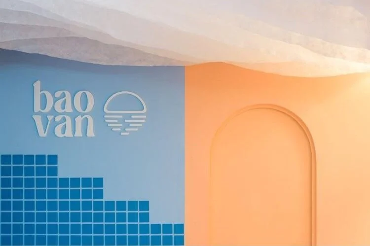
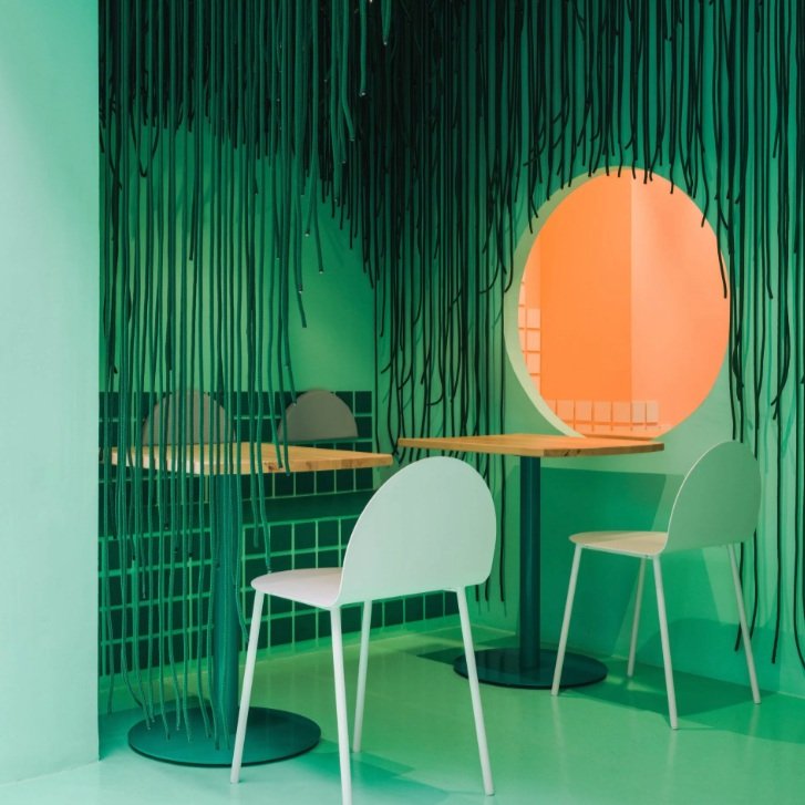
Valencia-based restaurant Baovan took inspiration from “beers, beach and baos”. Half of the dining area and bar is clad in bright peach to represent seashores, whilst the seating area is painted and tiled in marine blue to denote the ocean. The entranceway is green with ropes hanging from the ceiling to give the impression of stumbling through a forest to a secret beach. A semi-circular panel on the wall changes hues to resemble a setting sun on the horizon. And Hong Kong café Trois sports a similarly radiant look.
Baovan
Baovan
Baovan
Baovan
Trois
Trois
And in Madrid, Cara Mela cleverly uses colour blocking in the interiors of its pastry shop. It’s painted and tiled entirely in the same bold sea green, with matching wavy metal seating and wiggly-shaped tables. Equally monochrome is Udine, Italy’s Agli Amici. Its newly refurbished lounge is drenched in a digital blue tone, including the roof tiles, walls, chairs, tables and windowpanes. The only contrasting tinge comes from a circular shade-changing neon orange panel on the wall.
Cara Mela
Cara Mela
Agli Amici
Meanwhile, Mexican-Lebanese fusion eatery Filo in Mexico City takes colour and textural inspiration from the vibrant ingredients on its menu – like olive oil, pistachios, rosewater, figs, sumac and pepper – to create an eclectic 90s Memphis-style look. Similarly, Lyon-based Italian diner Piada chose soft, Instagrammable mint, yellow and lilac pastels, plus an overflow of plants in the establishment’s curved alcoves, to reflect its healthy offerings.
Filo
Filo
Filo
Piada
Piada
5. Tantalising Timepieces
Retro restaurants and bars transport customers back in time to specific places and periods – from glamourous 60s Rimini to mid-century Poland – using colour, texture, silhouettes, and vintage furniture and fittings. These transformative spaces ooze quaint vibes whilst also feeling fresh and modern.
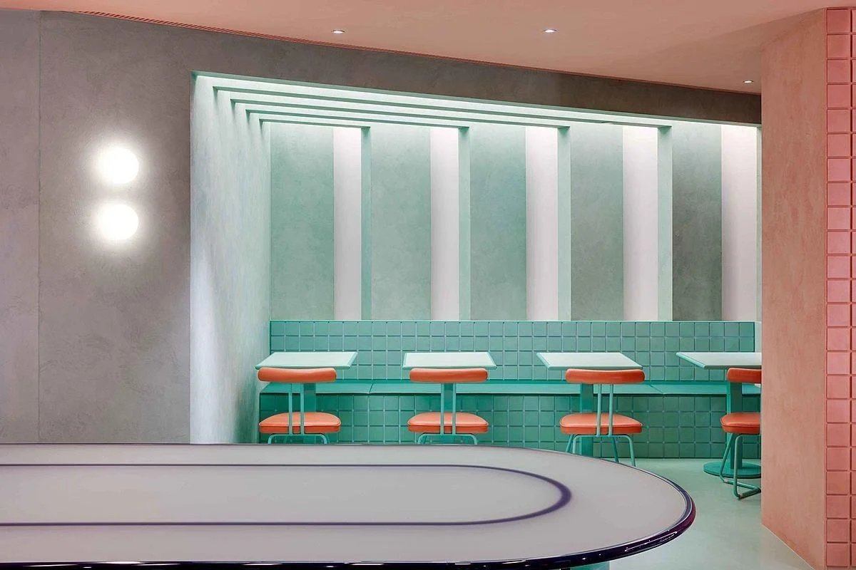
Frankfurt Airport’s Pezzo di Pane is heavily influenced by the glamour of Rimini, Italy in the 60s, with mint green walls, flamingo pink padded benches, and candy-tinged fringed parasols. Meanwhile, warm wood panelling covers the bar.
Elsewhere, UK Indian restaurant chain Dishoom’s Canary Wharf outpost takes inspiration from a fictional Irani café located near the Bombay Stock Exchange, which it brings to life with 70s furniture and light fixtures sourced from India. The focal point is a vintage triangular clock, similar to one found in the lobby of Mumbai's West End Hotel, close to the stock market in question.
Pezzo di Pane
Pezzo di Pane
Dishoom
Warsaw’s Syrena Irena – brought to life in a former 50s hotel – pays homage to mid-century design in a nod to its classic menu items hailing from the 50s and 60s. Cues include terrazzo tabletops, neon signs, milky white light sconces, mosaic tiles and triangular wooden stools. A palette of aquatic blue with pink, peach and coral tones and graphics reflects the eatery’s mermaid-themed branding.
And in New York, upscale Korean dining spot Oiji Mi blends elements from Manhattan’s gilded-age social clubs, like rich leather, velvet upholstery, and marble and dark walnut details. It’s inspired by 14th-century Korean hanok homes, with interlocking wooden beams across the ground and ceiling, and a traditional Daecheong wooden floor. The theme is carried further by light fittings based on the shapes and textures of traditional Korean jewellery.
Syrena Irena
Syrena Irena
Syrena Irena
Oiji Mi
Oiji M
6. Ecological Eateries
From spaces foregrounding repurposed and decomposable materials to subtle colour cues that nod to the effects of climate change, designers are exploring ways to establish sustainable interiors. This is particularly important, since 45% of British diners say a venue’s eco commitments are a key factor when choosing where to eat (Nutritics, 2022).
Va Bene Cicchetti, an Italian bar and small-plate restaurant located in a 50s socialist realist housing estate in Warsaw, subtly highlights the environmental issues facing Venice. In contrast to the warm red and gold interiors, the floors, skirting tiles, furniture legs and plinths up to 20cm from the ground are a marine turquoise shade, referencing Venice’s worsening high flood waters (known as acqua alta). And the basement bar – clad in marine turquoise from top to bottom – features a mosaic made from reclaimed Venetian Murano glass and wine bottle fragments.
Meanwhile, Bangalore-based eatery The Circus Canteen, sourced 90% of the materials – including scrap metal, furniture, toys and bike parts – via a city-wide donation drive. Its jigsaw-like floor is constructed with sample tiles from surrounding ceramic stores.
Va Bene Cicchetti
Va Bene Cicchetti
Va Bene Cicchetti
The Circus Canteen
The Circus Canteen
Taking a similar approach, the renovation of London’s Apricity featured second-hand and reclaimed furnishings and light fittings made from food waste. It also used timber from a replaced staircase as decorative cladding. Similarly, Gothenburg-based Japanese diner Vrå’s stool-cum-side-table is made from its own waste rice starch and oyster shells.
Elsewhere, South Korean agritech start-up N.Thing’s downtown Seoul café, Sik Mul Sung, showcases the former’s vertical farm technology. The space features a brightly lit, glass-fronted cultivation room from which vegetables are harvested and prepared for salads and ice cream, which are then served via a conveyer belt. The stainless-steel walls and surfaces and red stone flooring represent N.Thing’s ambitions to cultivate food on Mars.
Apricity
Apricity
Carolina Härdh
Vrå
Unseenbird
Unseenbird
Key Learnings
Offer Unbridled Escapism
As consumers face uncertain and difficult times, offer them an opportunity for fun and escapism through your interiors. This doesn’t have to mean opulence, but could incorporate joyous colour and humorous details – Baovan’s beach theme is a great example here.
Take Colour Inspiration from Ingredients
Look to Filo’s pistachio green and rosewater pink accents for inspiration. Can you up the multisensory ante by analysing the hues of menu items and ingredients, and incorporating them into the physical design of your space? And, beyond colour, can you find a way to sensorially reference the textures and/or fragrances of your dishes?
Use Mindful Material Sourcing
Finding alternative methods to source materials for hospitality spaces can not only result in a more sustainable selection of items and supplies, but can also force you to think more creatively about your design direction. It can also add a local-led edge, like at The Circus Canteen in Bangalore.
Reject Stereotypical Design Cues
Stand out from competitors that favour tired/clichéd choices by challenging pre-conceived design norms and aesthetics. See Berlin restaurant Jigi Poke’s minimalist Hawaiian interiors, a departure from traditional Tiki references. Such stereotypes can easily fall into cultural appropriation or racist territory, so there’s all the more reason to be more intentional and open-minded on this front.


